Lesson 4 Visualizing Microbiome Composition
This lesson focuses on composition-focused visualization—turning a microbiome feature table into interpretable summaries.
We use intermediate CSVs exported in Lesson 03 to generate clean, publication-ready visuals.
4.1 Learning objectives
By the end of this lesson, you will be able to:
- Create a sequencing depth plot
- Create a stacked bar plot of top genera across samples and groups
- Create a heatmap of taxa abundance
- Save all figures to a single
figures/folder using the CDI plotting workflow
4.2 Load intermediate data (from Lesson 03)
These files are created in Lesson 03 during rendering:
data/intermediate/dietswap-relative-tidy.csvdata/intermediate/dietswap-sample-depth.csvdata/intermediate/dietswap-taxa-totals.csv
from pathlib import Path
import pandas as pd

p_tidy  = Path('data/intermediate/dietswap-relative-tidy.csv')
p_depth = Path('data/intermediate/dietswap-sample-depth.csv')
p_taxa  = Path('data/intermediate/dietswap-taxa-totals.csv')

missing = [str(p) for p in [p_tidy, p_depth, p_taxa] if not p.exists()]
if missing:
    raise FileNotFoundError(
        'Missing intermediate CSVs. Render Lesson 03 first (or run the Rmd build) to generate them:\n- ' + '\n- '.join(missing)
    )

df = pd.read_csv(p_tidy)
depth = pd.read_csv(p_depth)
taxa = pd.read_csv(p_taxa)

df.head()| OTU | Sample | Abundance | subject | sex | nationality | group | sample | timepoint | timepoint.within.group | bmi_group | Phylum | Family | Genus | |
|---|---|---|---|---|---|---|---|---|---|---|---|---|---|---|
| 0 | Prevotella melaninogenica et rel. | Sample-187 | 0.769942 | kpb | male | AAM | DI | Sample-187 | 4 | 1 | obese | Bacteroidetes | Bacteroidetes | Prevotella melaninogenica et rel. |
| 1 | Prevotella melaninogenica et rel. | Sample-182 | 0.760767 | kpb | male | AAM | ED | Sample-182 | 1 | 1 | obese | Bacteroidetes | Bacteroidetes | Prevotella melaninogenica et rel. |
| 2 | Prevotella melaninogenica et rel. | Sample-210 | 0.750560 | qjy | female | AFR | ED | Sample-210 | 1 | 1 | overweight | Bacteroidetes | Bacteroidetes | Prevotella melaninogenica et rel. |
| 3 | Prevotella melaninogenica et rel. | Sample-104 | 0.748627 | vem | male | AFR | HE | Sample-104 | 3 | 2 | lean | Bacteroidetes | Bacteroidetes | Prevotella melaninogenica et rel. |
| 4 | Prevotella melaninogenica et rel. | Sample-168 | 0.747613 | mnk | female | AAM | HE | Sample-168 | 3 | 2 | obese | Bacteroidetes | Bacteroidetes | Prevotella melaninogenica et rel. |
4.3 Sequencing depth per sample
import matplotlib.pyplot as plt

depth_sorted = depth.sort_values('depth')

plt.figure(figsize=(12, 5))
plt.bar(range(len(depth_sorted)), depth_sorted['depth'])
plt.title('Sequencing depth per sample')
plt.xlabel('Samples (sorted)')
plt.ylabel('Total reads')
plt.xticks([])
plt.tight_layout()

show_and_save_mpl()
Saved PNG → figures/04_001.png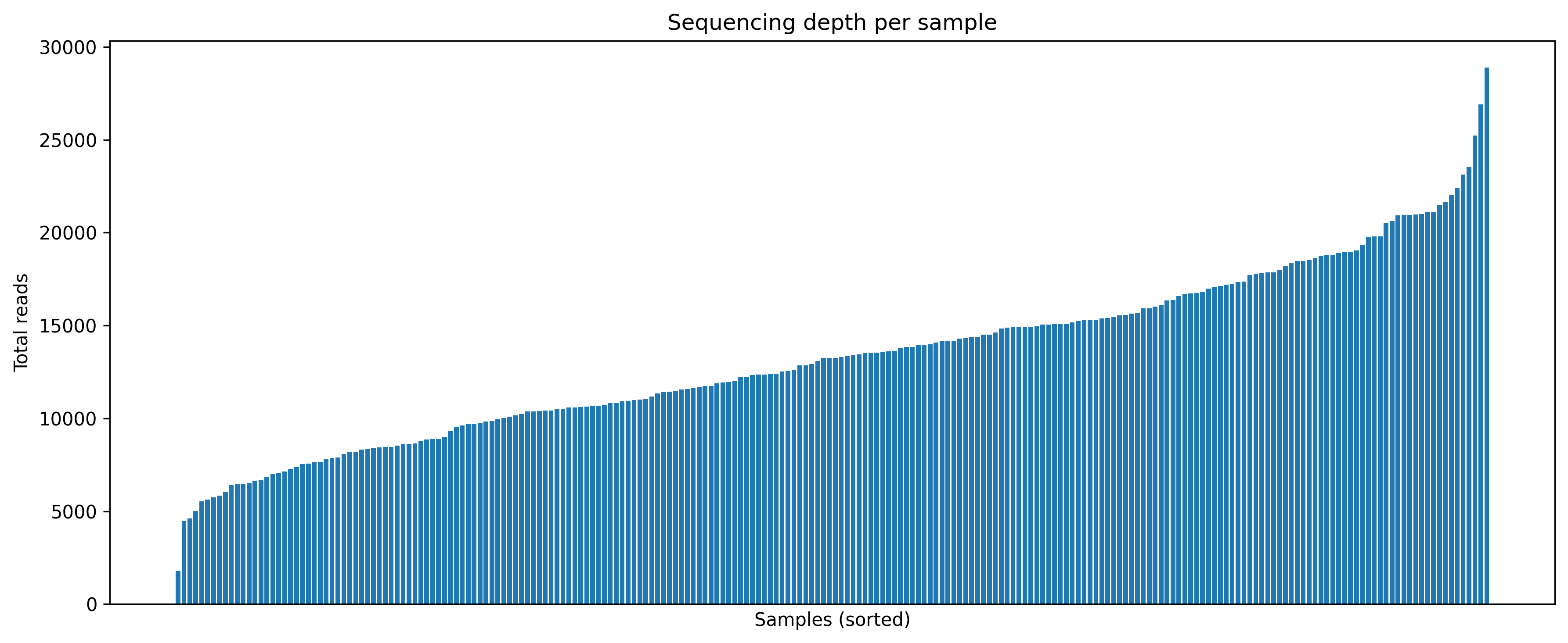
4.4 Stacked bar plot of top genera
We keep the top N genera and collapse the rest into Other for readability.
import numpy as np

rank_col = 'Genus' if 'Genus' in df.columns else ('OTU' if 'OTU' in df.columns else None)
if rank_col is None:
    raise ValueError('No taxonomic column found (expected Genus or OTU).')

top_n = 12
top_taxa = (
    df.groupby(rank_col)['Abundance']
      .sum()
      .sort_values(ascending=False)
      .head(top_n)
      .index
)

df_plot = df.copy()
df_plot[rank_col] = df_plot[rank_col].where(df_plot[rank_col].isin(top_taxa), other='Other')

wide = (df_plot.groupby(['Sample', rank_col])['Abundance'].sum().unstack(fill_value=0))

if 'group' in df_plot.columns:
    meta = df_plot[['Sample','group']].drop_duplicates().set_index('Sample')
    wide = wide.loc[meta.sort_values('group').index]

ax = wide.plot(kind='bar', stacked=True, figsize=(14, 5))
ax.set_title(f'Top {top_n} {rank_col} (relative abundance)')
ax.set_xlabel('')
ax.set_ylabel('Relative abundance')
ax.set_xticks([])
ax.legend(bbox_to_anchor=(1.02, 1), loc='upper left', title=rank_col)
plt.tight_layout()

show_and_save_mpl()
Saved PNG → figures/04_002.png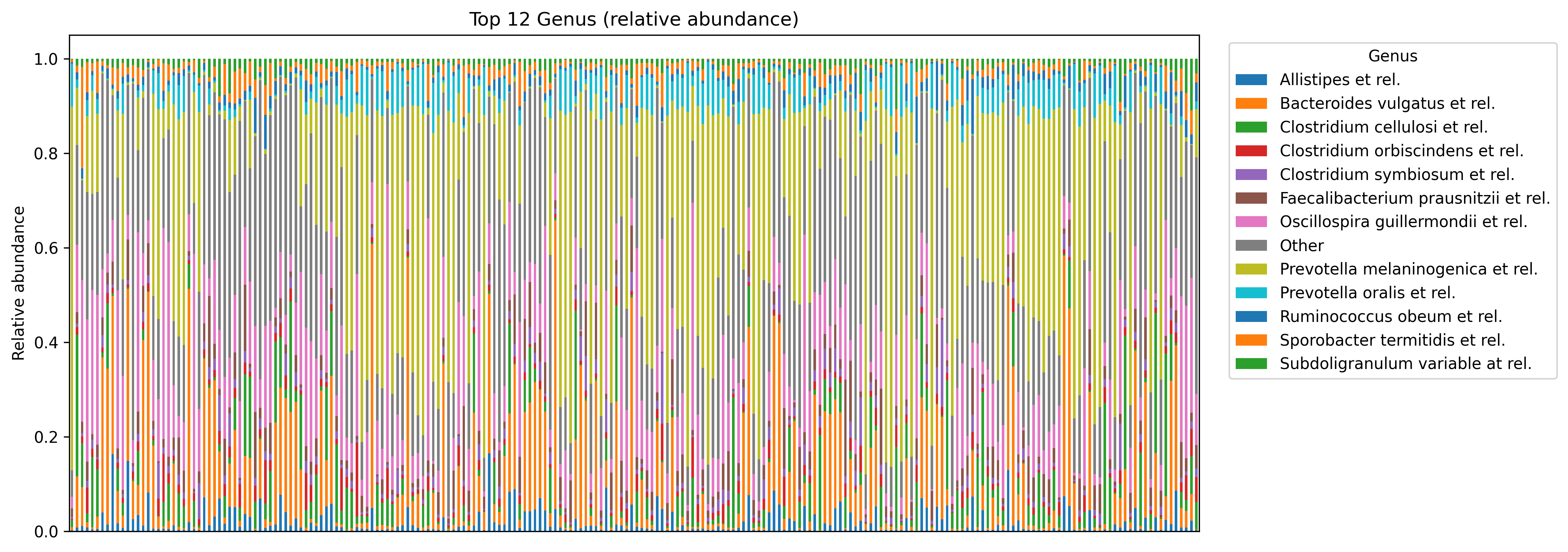
4.5 Heatmap of taxa abundance
import seaborn as sns

top_hm = (
    df.groupby(rank_col)['Abundance']
      .sum()
      .sort_values(ascending=False)
      .head(25)
      .index
)

hm = (df[df[rank_col].isin(top_hm)]
      .groupby([rank_col, 'Sample'])['Abundance']
      .sum()
      .unstack(fill_value=0))

hm_log = np.log10(hm + 1e-6)

plt.figure(figsize=(12, 7))
sns.heatmap(hm_log, cbar_kws={'label': 'log10(relative abundance)'})
plt.title(f'Top taxa heatmap ({rank_col}, log10 relative abundance)')
plt.xlabel('Sample')
plt.ylabel(rank_col)
plt.tight_layout()

show_and_save_mpl()
Saved PNG → figures/04_003.png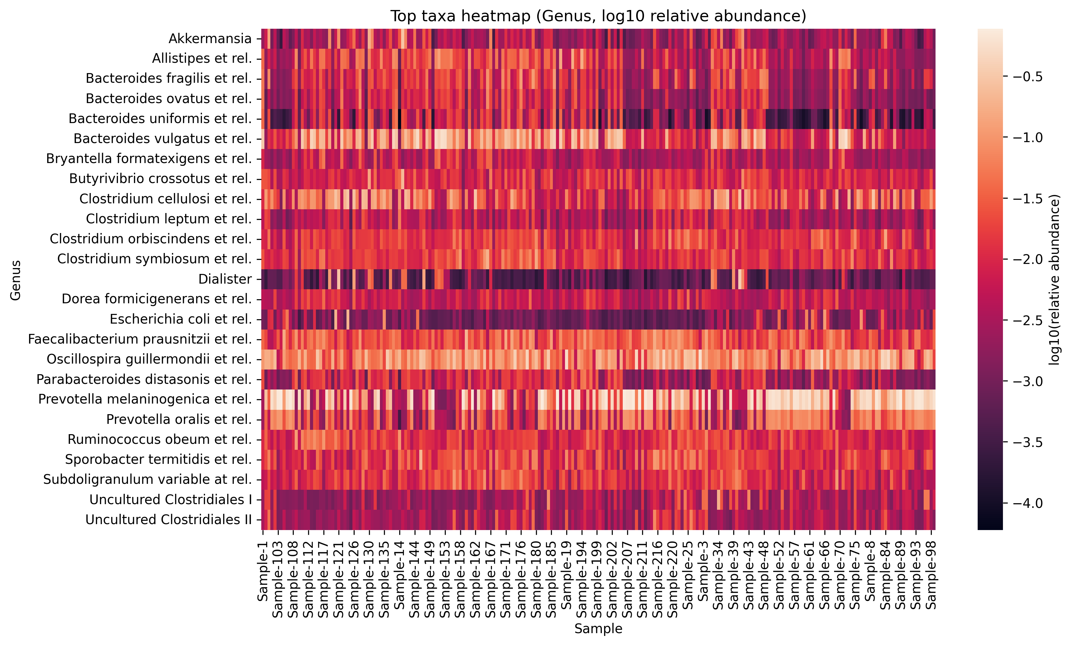
4.6 Key takeaways
- Sequencing depth provides essential context for composition plots
- Stacked bar plots are clearest with top taxa + simplified legends
- Heatmaps should be limited to top features and use log scaling for contrast
show_and_save_mpl()ensures figures are saved consistently tofigures/
Continue to Completing the Free Track