Q&A 11 How do you visualize OTU or Genus abundance using a heatmap?
11.1 Explanation
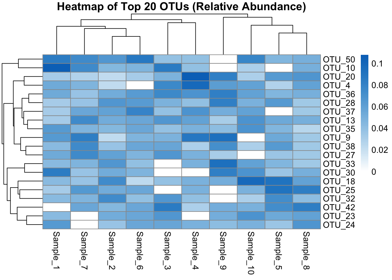
Heatmaps are excellent for visualizing microbial abundance patterns across samples. They help identify: - Co-occurring OTUs or genera - Sample clusters with similar profiles - High- or low-abundance taxa patterns
Heatmaps often include clustering on rows (features) and columns (samples), with scaling or log-transformation to improve interpretability.
In this example, we visualize the top 20 most abundant OTUs across all samples.
11.2 Python Code
import pandas as pd
import seaborn as sns
import matplotlib.pyplot as plt

# Load OTU table
otu_df = pd.read_csv("data/otu_table_filtered.tsv", sep="\t", index_col=0)

# Select top 20 OTUs by total abundance
top_otus = otu_df.sum(axis=1).nlargest(20).index
top_otu_df = otu_df.loc[top_otus]

# Normalize (relative abundance per sample)
rel_abund = top_otu_df.div(top_otu_df.sum(axis=0), axis=1)

# Plot heatmap
plt.figure(figsize=(10, 8))
sns.heatmap(rel_abund, cmap="YlGnBu", linewidths=0.5)
plt.title("Heatmap of Top 20 OTUs (Relative Abundance)")
plt.xlabel("Samples")
plt.ylabel("OTUs")
plt.tight_layout()
plt.show()
11.3 R Code
library(tidyverse)
library(pheatmap)

otu_df <- read.delim("data/otu_table_filtered.tsv", row.names = 1)

# Select top 20 OTUs by abundance
top_otus <- rowSums(otu_df) %>%
  sort(decreasing = TRUE) %>%
  head(20) %>%
  names()

top_otu_df <- otu_df[top_otus, ]

# Convert to relative abundance
rel_abund <- sweep(top_otu_df, 2, colSums(top_otu_df), FUN = "/")

# Plot heatmap
pheatmap(rel_abund,
         color = colorRampPalette(c("white", "#0073C2FF"))(100),
         fontsize = 11,
         main = "Heatmap of Top 20 OTUs (Relative Abundance)")